Design System
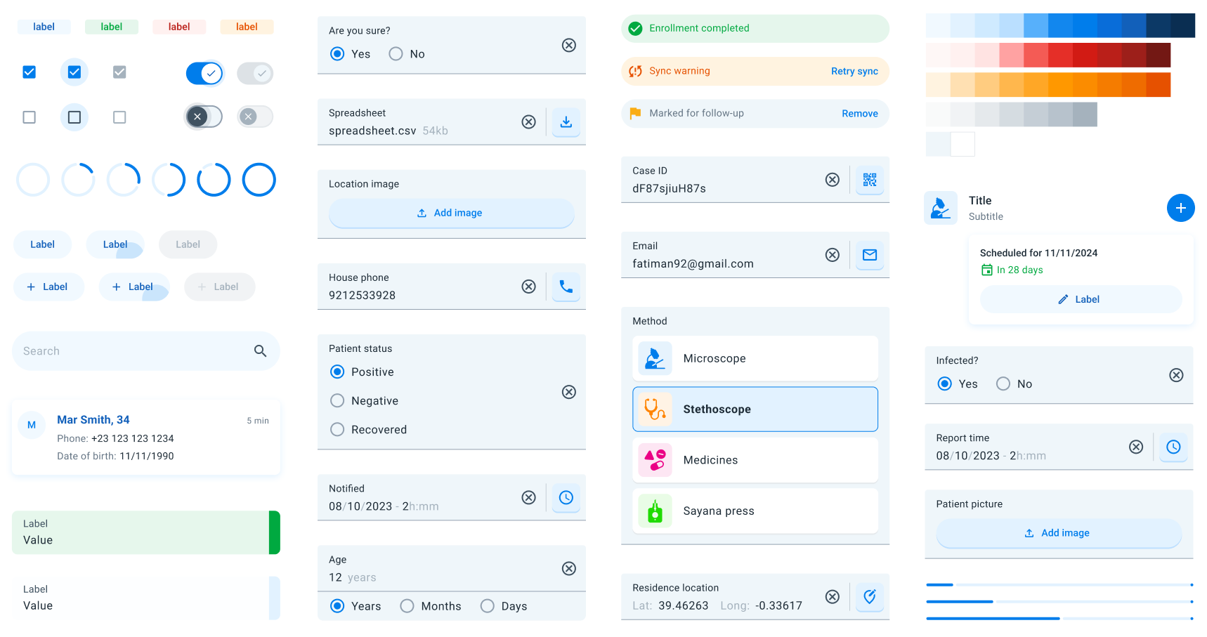
The DHIS2 Mobile UI Library is built upon the DHIS2 Mobile Design System Figma library. This design system offers a comprehensive set of guidelines, components, and best practices to ensure consistency and enhance user experience across all DHIS2 mobile applications.
Overview
The design system encompasses a wide array of elements that contribute to a cohesive and intuitive user interface. Below is an organized list of the key components and design principles included in the system:
Foundations
- Color: A curated palette of neutral colors used consistently throughout the UI to convey meaning and improve usability.
- Elevation: Guidelines for applying shadows and depth effects to create a visual hierarchy and indicate interactivity.
- Icons: A standardized set of icons representing common actions, objects, and statuses to enhance recognition and reduce cognitive load.
- Typography: Consistent font styles and text hierarchies for headings, body text, and captions to improve readability and accessibility.
- Shape: Principles for using shapes, such as rounded corners and specific aspect ratios, to maintain a consistent look and feel.
Components
- Badges: Small indicators that display numerical values or statuses, often attached to icons or avatars.
- Bottom Sheets: Modal surfaces that slide up from the bottom of the screen to present supplementary content or actions without navigating away.
- Buttons: Interactive elements that trigger actions, available in various styles like text, outlined, and contained buttons.
- Checkboxes: Controls that allow users to select one or multiple options from a list, indicating selection with a checkmark.
- Chips: Compact elements representing inputs, attributes, or actions, often used for filters or selections.
- Forms: Structured layouts for data entry, including input fields, dropdowns, and validation messages. They allow easily capture data for all the data entry types in the DHIS2 world.
- Indicators: Used to provide specific information like feedback or program indicators.
- Info Bar: A horizontal component that displays brief messages, alerts, or notifications to the user.
- Navigation Bar: A bar located at the bottom of the screen for primary navigation between app sections.
- Progress Indicators: Linear and circular indicators that show the progress of a task or process.
- Radio Buttons: Controls that allow users to select a single option from a set, displaying the selection with a filled circle.
- Lists: Organized collections of items, and cards to display text, images, or interactive elements, ready for DHIS2 objects.
- Menu: A list of options or actions presented contextually or via a dedicated button, often used for secondary navigation.
- Search Bar: An input field where users can enter queries to search and filter content within the app.
- Sections: Divisions within a page or screen that group related content or functionality together.
- Snackbar: Temporary messages that appear at the bottom of the screen to provide brief feedback about an operation.
- Switches: Toggles that allow users to turn options or settings on or off, indicating the current state immediately.
- Tags: Labels used to categorize, organize, or filter content, displayed as small, rounded rectangles.
- Top Bar: The header area at the top of the screen, usually containing the app title, navigation controls, and action items.
Getting Started
To incorporate the DHIS2 Mobile Design System into your project:
- Explore the Figma Library: Familiarize yourself with the available components and styles by accessing the Figma library.
- Use the Figma Library for Mock-ups and Prototypes: Before starting development, you can utilize the Figma library to create mock-ups and prototypes. This allows you to visualize the app's design and functionality, facilitating better planning and collaboration among team members.
- Follow the Guidelines: Apply the design principles and component guidelines to ensure a consistent and user-friendly interface.
- Maintain Accessibility: Ensure all design elements meet accessibility standards for color contrast, font sizes, and interactive elements.
- Collaborate and Contribute: Share feedback, suggest improvements, or contribute new components to help evolve the design system.
For more information or feedback, please visit the DHIS2 Community of Practice.