How to display Alerts in your App
To display an alert in your web application, you will need to use the Alert Component from the @dhis2/ui library. However, you do not need to install this library as the best practice is to display the alert using the useAlert hook from the @dhis2/app-runtime library.
In this guide we'll walk you through, step by step, how to display an alert in your application and handle the different alerts states.
Prerequisites
To be able to implement the alert in your application, you need to have the following:
- A web application built using the DHIS2 Application Platform
- A basic understanding of React hooks
If you do not yet have a web application built using the DHIS2 Application Platform, you can follow the Getting Started guide to create a new application.
Step 1: Import the useAlert hook
The useAlert hook is a custom hook provided by the @dhis2/app-runtime library. To use it, you need to import it in your file.
import { useAlert } from '@dhis2/app-runtime'
Now that you have imported the useAlert hook, you can use it in your component.
Step 2: Send a default alert notification
Now that you have imported the useAlert hook, you can use it to send a default alert notification. The useAlert hook returns an object with two functions: show and hide.
The show function is used to display the alert, while the hide function is used to hide the alert. After hiding (automatically or by code), the alert will be removed from the alert stack. But you can re-add it by calling the show function again.
const App() => {
    const { show, hide } = useAlert('This is a default alert message')

    // Display the alert, somewhere later in your code
    show()
}
To hide the alert, you can call the hide function, anywhere in your code where you have access to the hide function.
const App() => {
    // [...]
    hide()
}
Step 3: Adding options to the alert
You can also add options to the alert, such as the duration of the alert, the type of alert, and the action to be taken when the alert is clicked.
const App() => {
    const { show, hide } = useAlert('This is a default alert message', {
        duration: 30000, // 30 seconds
        critical: true, // show the alert as critical
        permanent: true // don't auto-hide the alert
    })
}
You can see the full list of options in the AlertBar component documentation.
Step 4: Displaying dynamic alerts
You can also display dynamic alerts by passing a function to the useAlert hook. This function will receive the arguments passed to the show function.
The code below will be capable of displaying alerts with different messages and options depending on the arguments passed to the show function. Two of the states represented, in the image below:
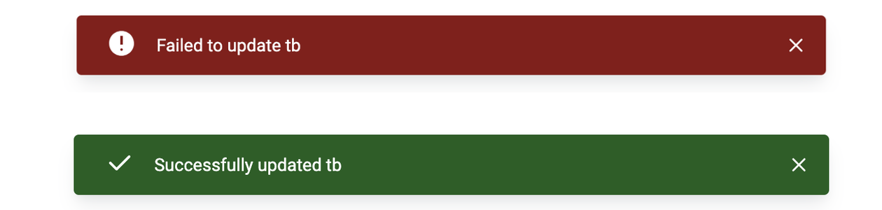
The first state is a critical alert with the message Failed to update tb, while the second state is a success alert with the message Successfully updated tb.
const App() => {
    const { show, hide } = useAlert(
        ({ program, success }) => (success ? `Successfully updated ${program}` : `Failed to update ${program}`),
        ({ success }) => isActive ? { critical: true } : { success: true }
    )

    // Display the alert, somewhere else in your code
    show({ program: 'tb', success: true })
}
In the example above, the alert message will be displayed as Failed to update tb and will be shown as critical. However, if you were to call the show function with success: true, the alert would show with a success state and the message Successfully updated tb. Updating the name will also change the message displayed in the alert dynamically.
This allows you to configure the Alert once and reuse it with different messages and options depending on the state of your application.
Conclusion
In this guide, you learned how to display alerts in your application using the useAlert hook from the @dhis2/app-runtime library. You also learned how to handle different alert states and display dynamic alerts. You can now use this knowledge to display alerts in your application and provide feedback to your users.
You can read more about the useAlert hook in the official documentation, and find all properties to be used in the AlertBar component in the AlertBar documentation.